Health Advocate Member Experience Platform
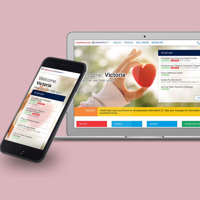
To increase engagement and bring the offering up to date, West Health Advocate launched an updated, web-based app portal to its extensive package of benefits and information. As a result, member engagement expanded rapidly and the product quickly won industry awards.
My role: Led UX and design for Health Advocate’s relaunched member experience, creating a unified platform and design language via responsive web and mobile app.
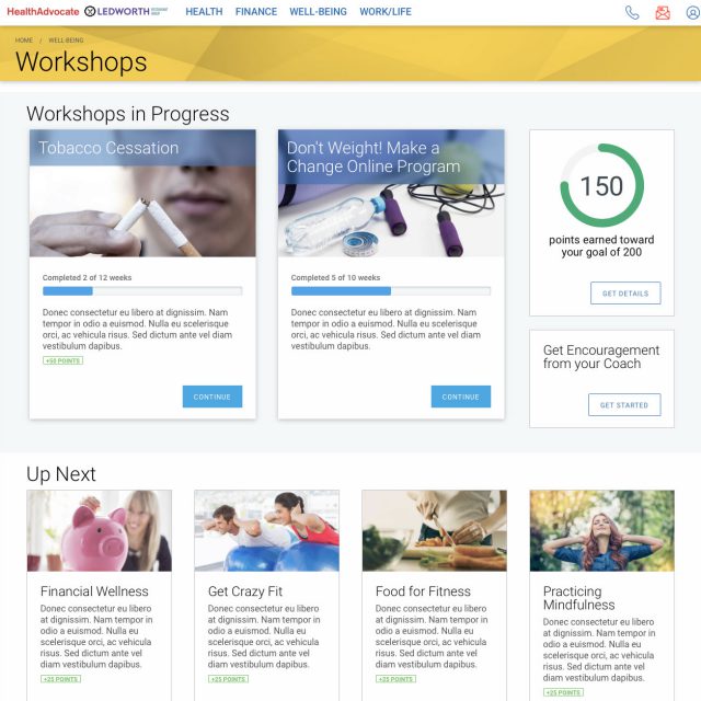
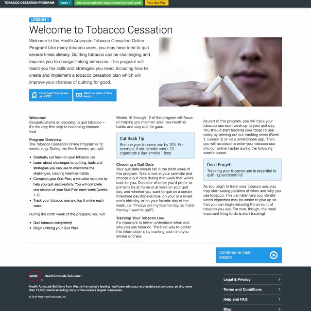
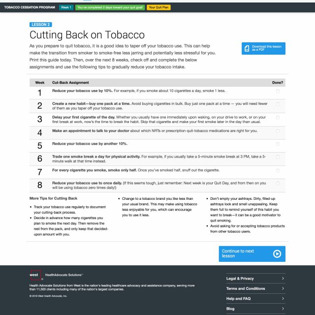
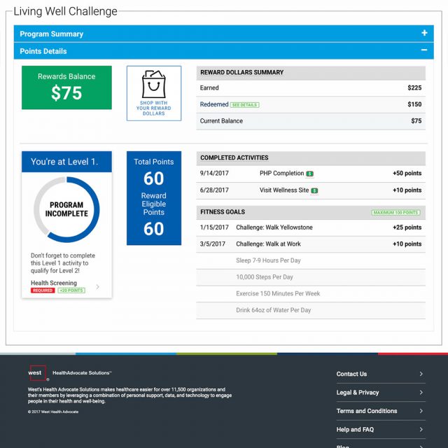
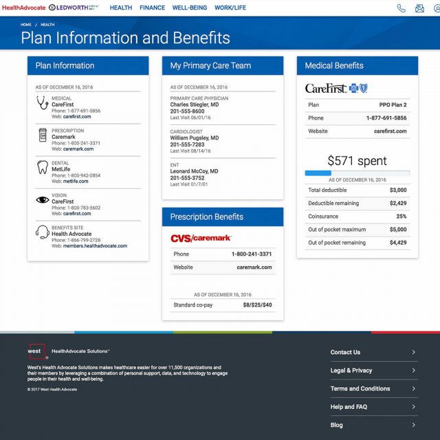
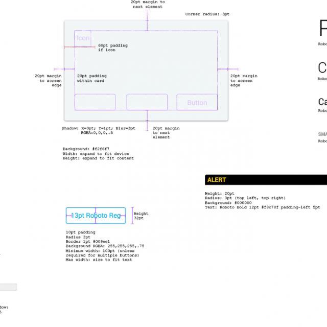
Tasked with creating a portal that was both simple and extensible for the future, I built a design language consisting of cards. This easy-to-understand interface for both mobile and web provides an almost unlimited expansion framework.
BEFORE
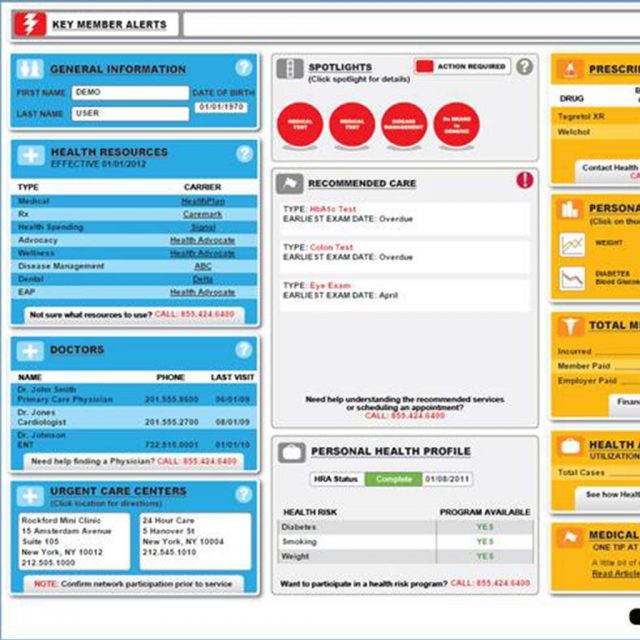
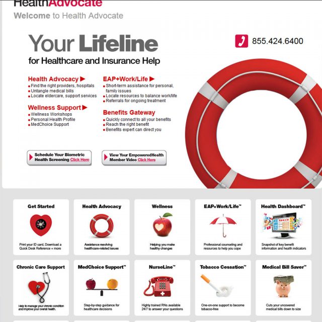
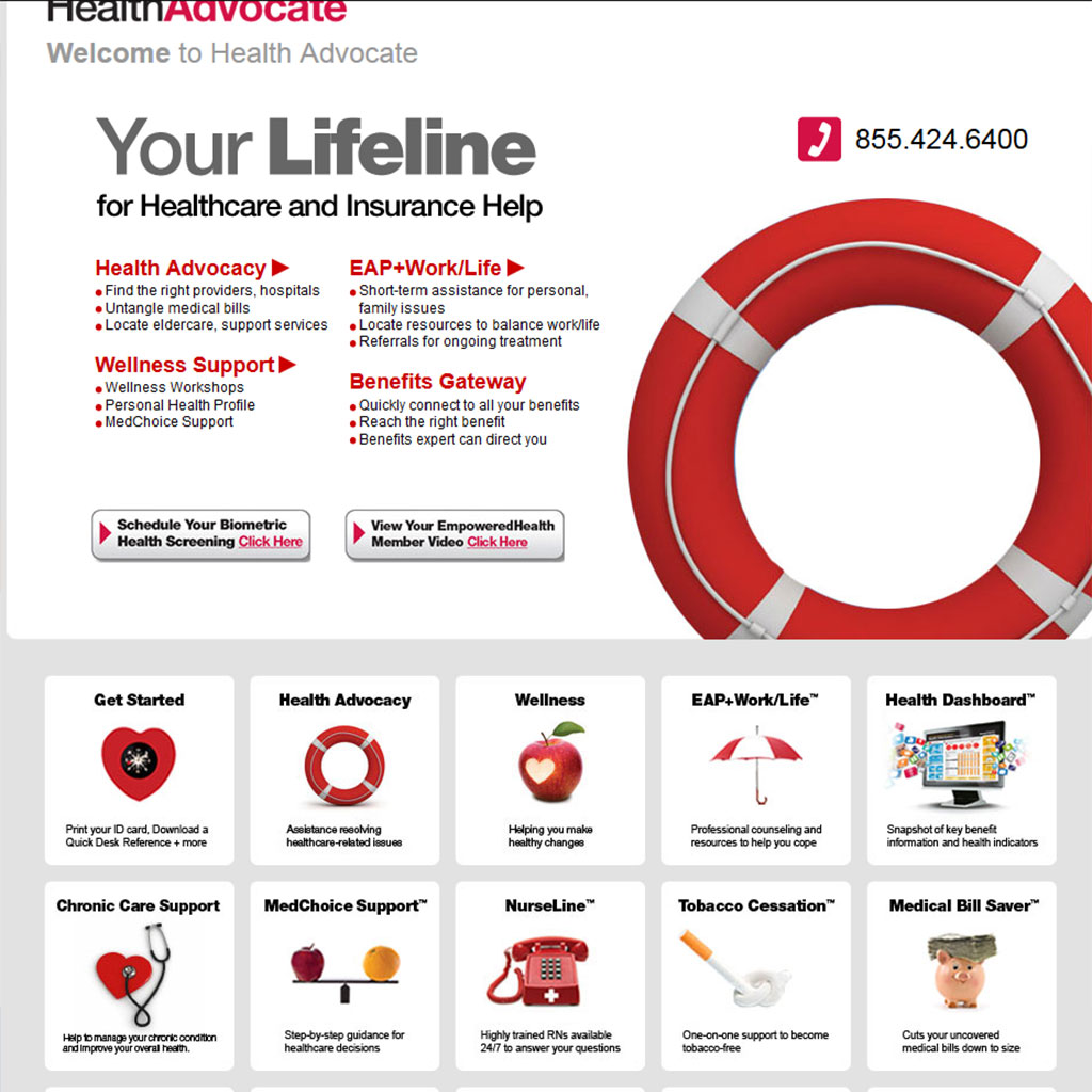
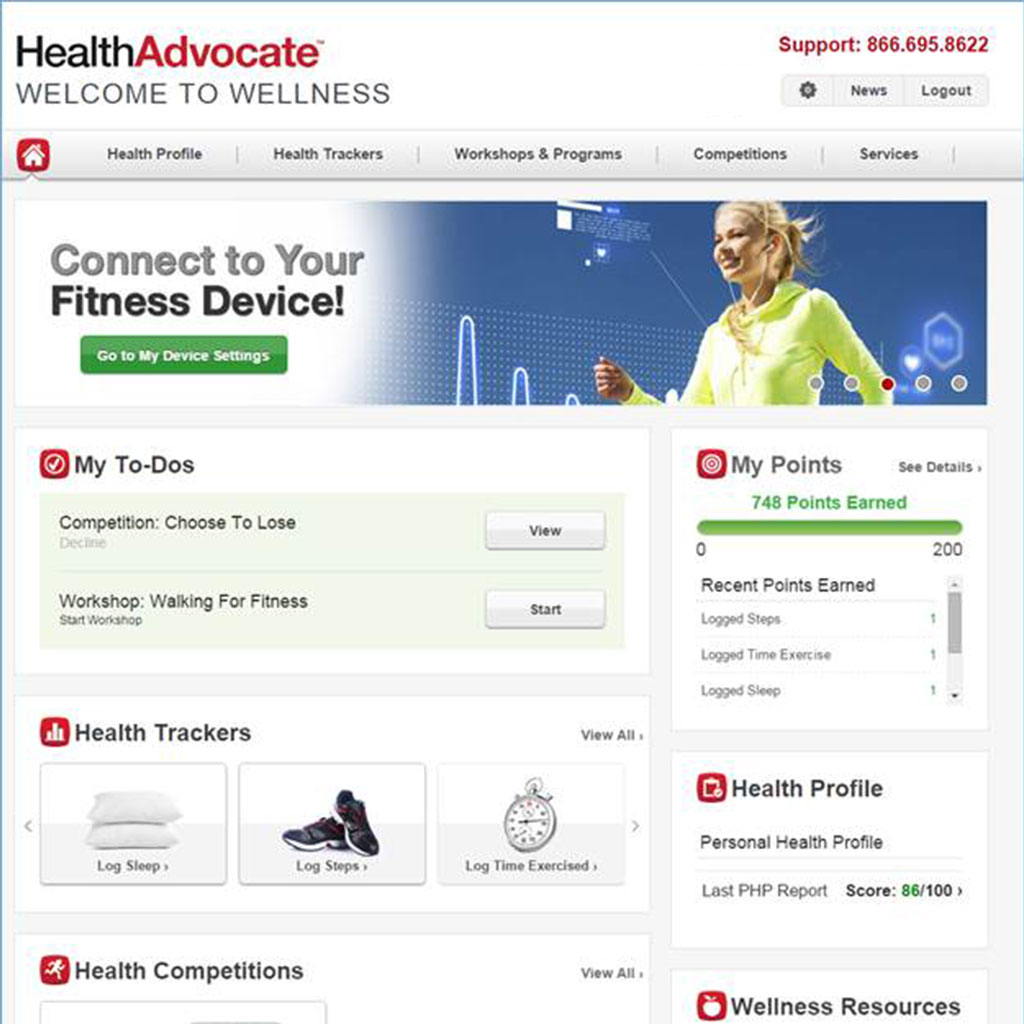
The existing member site was slow, outdated, and designed without regard to accessibility or bandwidth limitations. All buttons were rendered images; there was no grouping of content or linear design making it hard to find specific information. Pages were static in content and size. Viewing the site required a specific size screen — not only was it not responsive, but it didn’t conform to variable sized PC screens.
AFTER
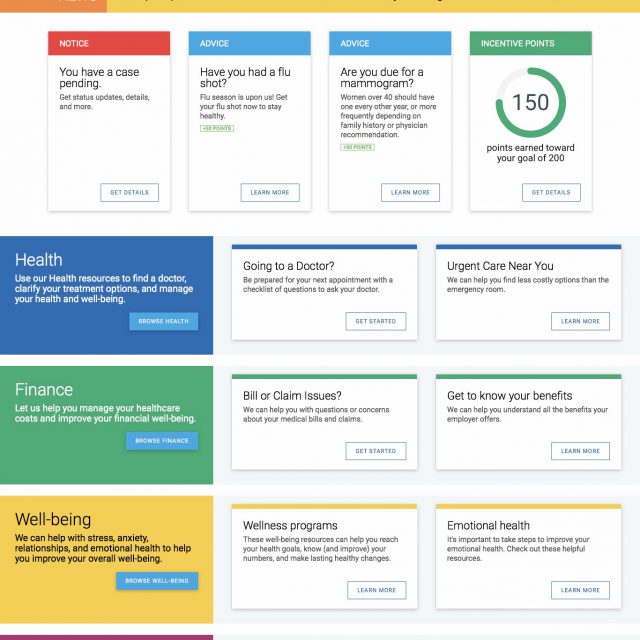
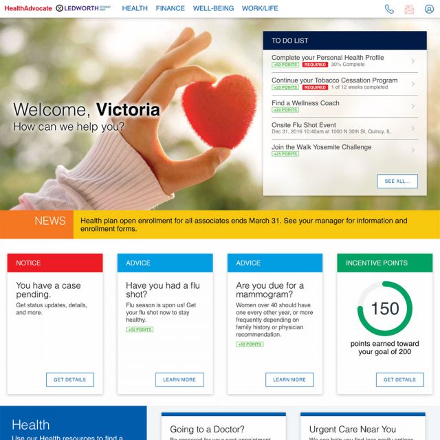
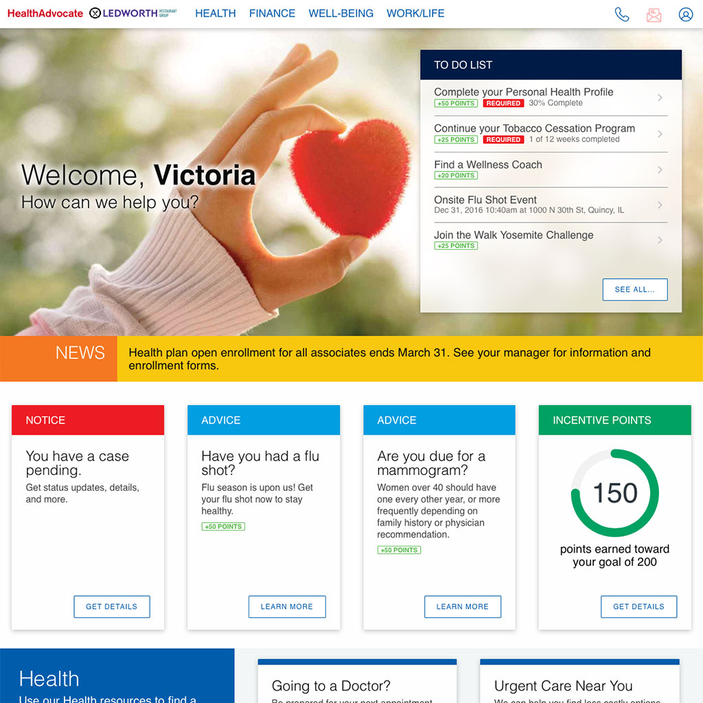
The new home page uses CSS to style content rather than rendered image, providing a high level of accessibility. The page is completely responsive allowing use on all size screens. Content is grouped and prioritized so that members see what’s most important first. The design moves Health Advocate into the branding of its parent company, West, without sacrificing its own identity.
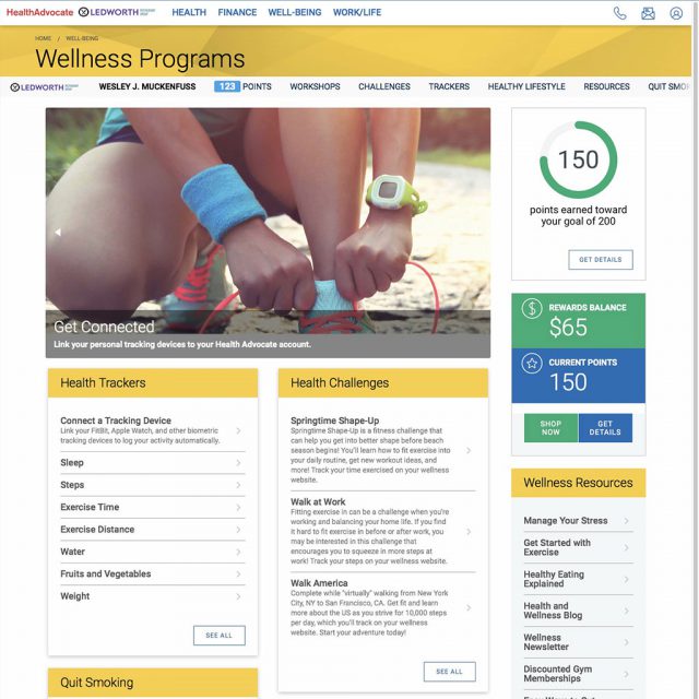
In the redesign, all content is grouped with clear headings. Like information is contained within a card, which allows “bite size” pieces allowing more successful skimming of the page. The card paradigm also makes it extremely simple to add, delete, or reprioritize content, which changes according to the members’ benefit level or personal needs.
